Why Font Choice Matters More Than You Think
Readers make a genre judgment in less than a second when they see a book cover thumbnail. Before they read the title, before they see the author name, their brain has already categorized the book based on visual cues. Typography is one of the strongest of those cues.
A thriller with a script font looks like a romance. A literary novel with a chunky sans-serif looks like a self-help book. A romance with a distressed horror font sends readers running. Font choice is not decoration. It is communication.
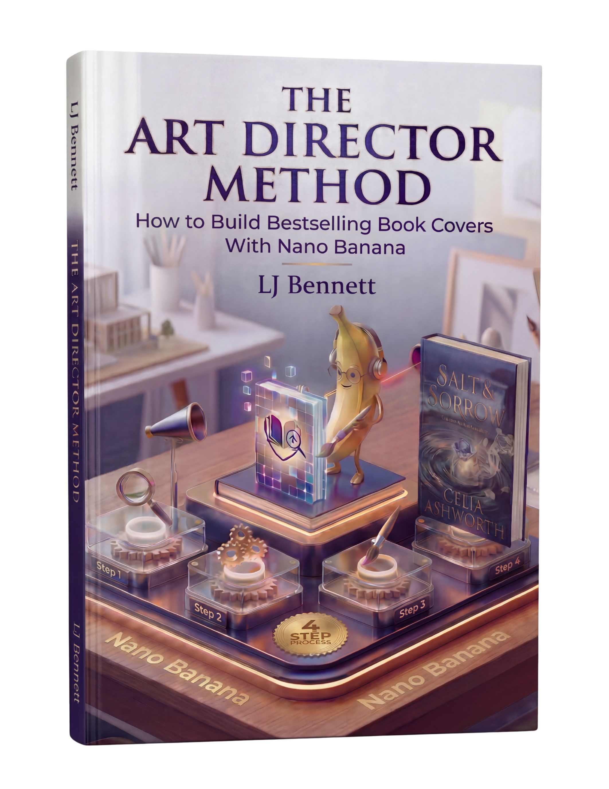
After 30 years in publishing, I can tell you that font selection is one of the first things professional designers get right and one of the last things self-publishers learn. The Art Director Method includes a Genre Vibe Cheat Sheet that maps font styles to genres so you never have to guess.
Font Recommendations by Genre
Romance
Script, calligraphy, or elegant serif fonts for the title. Clean serif or sans-serif for the author name.
- ● Free (Google Fonts): Great Vibes, Pinyon Script, Dancing Script, Playfair Display
- ● Premium: Beloved Script, Burgues Script, Parfumerie Script
- ● Dark Romance: Cinzel, Cormorant Garamond, or bolder serif options
Thriller / Suspense
Bold, condensed sans-serifs. Uppercase. High impact. The title should feel urgent and aggressive.
- ● Free (Google Fonts): Bebas Neue, Oswald, Anton, Barlow Condensed
- ● Premium: Tungsten, Knockout, Trade Gothic Bold Condensed
Fantasy / Sci-Fi
Decorative serifs or stylized display fonts for fantasy. Clean, geometric fonts for sci-fi.
- ● Fantasy (Free): Cinzel, Uncial Antiqua, MedievalSharp, Almendra
- ● Sci-Fi (Free): Orbitron, Rajdhani, Exo 2, Audiowide
- ● Premium: Trajan Pro, Eurostile, Futura
Literary Fiction
Elegant, classic serifs. Understated and refined. The typography says "this is serious writing."
- ● Free (Google Fonts): Cormorant Garamond, Libre Baskerville, EB Garamond, Spectral
- ● Premium: Adobe Garamond Pro, Baskerville, Caslon
Non-Fiction / Self-Help
Clean, modern sans-serifs or bold serifs. The font should feel authoritative and accessible.
- ● Free (Google Fonts): Montserrat, Raleway, Poppins, Lora, Source Serif Pro
- ● Premium: Proxima Nova, Gotham, Freight Sans
Horror
Distressed, hand-drawn, or heavy display fonts. The title should create unease.
- ● Free (Google Fonts): Nosifer, Creepster, Eater, Butcherman
- ● Subtle Horror (Free): Playfair Display Black, Cormorant Bold, Cinzel Decorative
Note: Overtly "scary" fonts can look cheap. Many bestselling horror covers use elegant fonts with unsettling imagery instead.
Cozy Mystery / Children's
Friendly, rounded, playful fonts. The title should feel warm and inviting.
- ● Free (Google Fonts): Fredoka, Quicksand, Comfortaa, Baloo 2, Nunito
- ● Premium: Brandon Grotesque, Avenir Rounded
Where to Find Fonts
Google Fonts (Free)
fonts.google.com. Over 1,500 font families, all free for commercial use including book covers. Download .ttf or .otf files and upload them to Canva, Photopea, or Photoshop. This is where most indie authors should start.
Creative Market (Paid)
creativemarket.com. Individual font purchases starting around $15-30. Excellent for unique display fonts that help your cover stand out. Always check the license includes commercial print use.
MyFonts (Paid)
myfonts.com. The largest font marketplace. Filter by style, weight, and use case. More expensive than Creative Market but the selection is unmatched. Great for finding the exact font you saw on a bestseller.
Font Squirrel (Free)
fontsquirrel.com. Curated collection of free fonts with clear commercial-use licensing. Smaller selection than Google Fonts but every font is hand-picked for quality.
Font Pairing Rules
1. Contrast, not conflict
Your two fonts should be clearly different from each other. A decorative title font paired with a clean body font creates pleasing contrast. Two similar fonts (like two different sans-serifs) create confusion, not harmony.
2. One font does the heavy lifting
The title font is the star. It carries the genre signal, the personality, the visual punch. The author name font is the supporting player. It should be readable and clean without competing for attention.
3. Match the mood, not the style
Both fonts should feel like they belong in the same world. A playful script title paired with a rigid geometric sans-serif feels disjointed. A flowing script paired with an elegant thin serif feels cohesive. The fonts do not need to look alike, but they need to feel alike.
The Art Director Method includes a complete Font Pairing Guide with pre-built combinations for every genre, plus a walkthrough of how to research font choices by studying bestsellers in your category.
This is exactly what The Art Director Method using Nano Banana teaches you to do right.
Turn Nano Banana from a slot machine into your creative partner.
Get the Guide - $19.99Frequently Asked Questions
Yes. Google Fonts are free for commercial use, including book covers. Fonts from sites like Font Squirrel and DaFont may have different licenses, so always check the license before using them commercially. Many bestselling book covers use Google Fonts. Free does not mean low quality. Fonts like Playfair Display, Bebas Neue, Lora, and Montserrat are used on professional covers regularly.
Two maximum. One for the title and one for the author name. If you want visual variety, use different weights within the same font family (bold for the title, regular for the author name). Using three or more fonts creates visual chaos and is one of the most common signs of an amateur cover.
Romance covers typically use script or calligraphy fonts for the title paired with a clean serif or sans-serif for the author name. Free options include Great Vibes, Pinyon Script, and Dancing Script for the title, paired with Playfair Display or Lora for the author name. Dark romance and romantic suspense trend toward bolder, edgier fonts like Cinzel or Oswald.
The best sources for premium book cover fonts are Creative Market, MyFonts, and Adobe Fonts (included with a Creative Cloud subscription). Creative Market offers individual font purchases starting around $15-30. MyFonts has the largest selection with detailed filtering by style. Always purchase a desktop license that covers commercial print use.
The simplest rule: pair a decorative or display font (for the title) with a clean, simple font (for the author name). Contrast is key. A script title pairs with a sans-serif author name. A bold serif title pairs with a light sans-serif. Avoid pairing two fonts that are too similar, as they will look like a mistake rather than a design choice.