What Are Genre Visual Codes?
Genre visual codes are the patterns that readers use to identify what kind of book they're looking at before reading a single word. They include color palette, typography style, imagery type, composition, and even texture. These codes develop over decades of publishing and marketing. They're not random. They exist because they help readers find the books they want.
As an author, understanding these codes is the single most important cover design skill you can develop. A cover that breaks genre codes - no matter how beautiful - will confuse readers and cost you sales. A cover that nails genre codes will attract the right readers even if the design is relatively simple.
Romance
Color palette: Warm tones - golds, pinks, deep purples, burgundy. Bright and saturated for contemporary, muted and rich for historical. Typography: Script fonts for titles are the genre standard. Decorative serif for subtitles. Imagery: Couples (close-up or full body depending on sub-genre), single figures in evocative poses, or symbolic objects (rings, flowers, silhouettes). Key signal: Warmth. Everything should feel warm, inviting, and emotionally charged.
Sub-genres matter enormously in romance. Dark romance uses dramatically different codes from sweet romance. Regency romance looks nothing like contemporary billionaire romance. Always research your specific sub-genre.
Thriller / Suspense
Color palette: Dark - deep blues, blacks, grays, with red or yellow accents for danger. High contrast. Typography: Bold sans-serif, often all caps. Clean and sharp. Imagery: Isolated figures, empty landscapes, urban environments, partially obscured faces. Key signal: Tension. The cover should feel like something is about to happen.
Fantasy
Color palette: Rich and deep - forest greens, royal purples, midnight blues, burnished golds. Typography: Ornate serif fonts, sometimes with decorative elements. Title is usually large and imposing. Imagery: Detailed illustrations or dramatic scenes - castles, magical elements, warriors, mythical creatures. Key signal: Scale and wonder. The cover should feel like a portal to another world.
Urban fantasy and epic fantasy have diverged significantly. Urban fantasy borrows thriller codes (darker, grittier, more minimal), while epic fantasy goes maximalist with illustration and detail.
Science Fiction
Color palette: Cool tones - blues, silvers, whites, neon accents. Typography: Clean sans-serif, often futuristic or minimalist. Imagery: Space, technology, alien landscapes, silhouettes against cosmic backdrops. Key signal: The future. Whether hopeful or dystopian, the cover should feel like it exists ahead of our current time.
Mystery / Cozy Mystery
Traditional mystery color palette: Muted, sophisticated - dark greens, navy, burgundy. Cozy mystery color palette: Bright, cheerful - pastels, warm yellows, sky blues. Typography: Traditional mystery uses classic serif. Cozies use playful, rounded fonts. Imagery: Traditional mystery uses atmospheric settings, clues, shadowy figures. Cozies use illustrated scenes, pets, food, charming settings. Key signal: Traditional mystery signals intrigue. Cozy mystery signals charm and warmth with a puzzle.
Horror
Color palette: Very dark - blacks, deep reds, sickly greens. Minimal color. Typography: Can range from distressed to elegant depending on sub-genre. Imagery: Suggestion over showing. The most effective horror covers imply dread rather than depicting gore. Dark spaces, distorted familiar objects, isolation. Key signal: Unease. The reader should feel slightly uncomfortable looking at it.
Literary Fiction
Color palette: Varies widely but tends toward muted, artistic palettes. Typography: Classic serif fonts, often understated. The author name may be as prominent as the title. Imagery: Minimalist, conceptual, or artistic. Abstract compositions, single symbolic objects, photography with artistic treatment. Key signal: Sophistication. The cover should feel intentional and curated.
Nonfiction / Self-Help
Color palette: Bold, clean, high-contrast. Often uses a single dominant color. Typography: Large, bold, highly readable. The title IS the cover in many cases. Imagery: Minimal or none. Icons, simple graphics, or author photo. Key signal: Clarity and authority. The cover should communicate "this book will give you answers."
Using Genre Codes with AI
Understanding genre codes is step one. Translating them into effective AI prompts is step two. When you tell an AI tool "make a thriller cover," it guesses at what that means. When you specify the exact color palette, lighting mood, composition style, and atmospheric qualities of your sub-genre, the AI delivers dramatically better results.
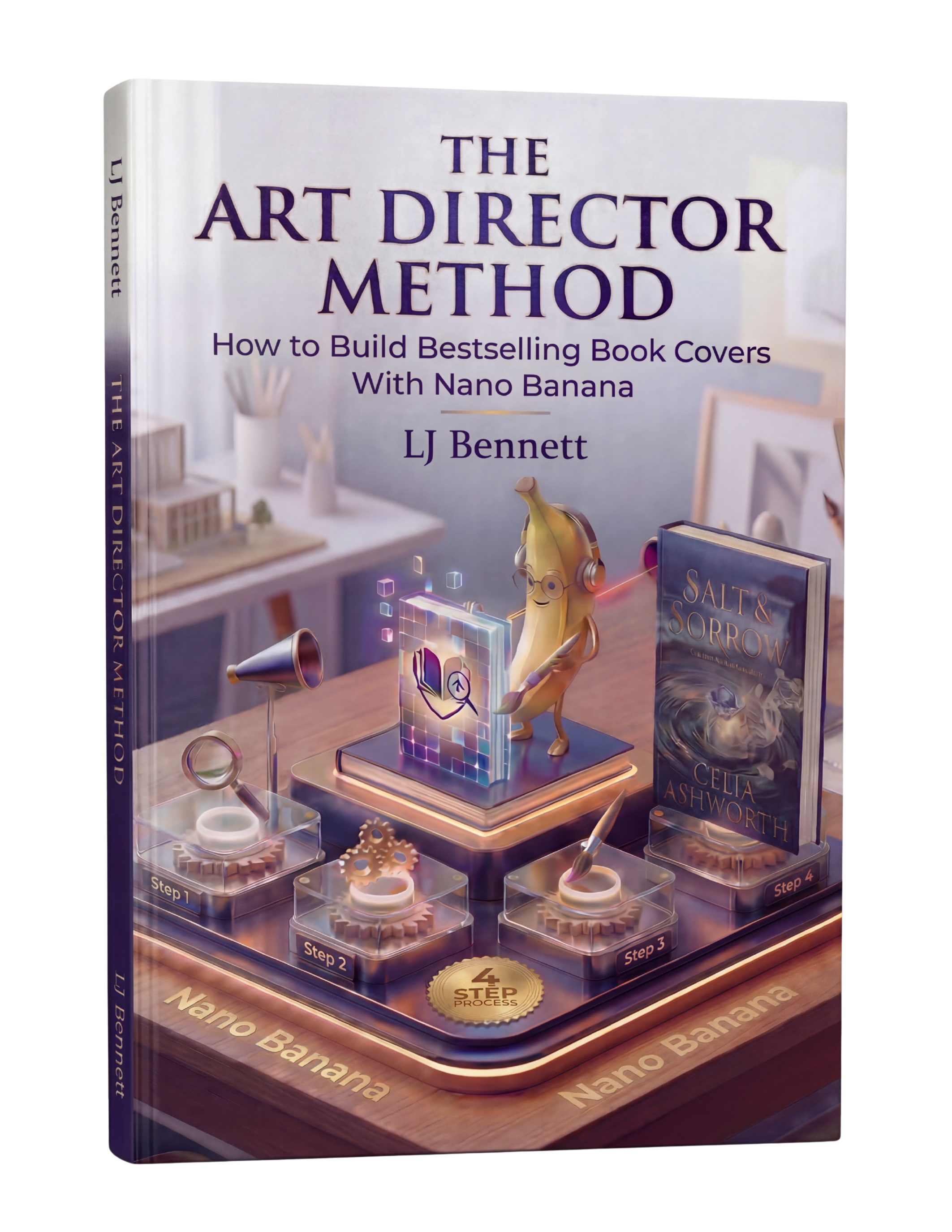
The Art Director Method includes detailed genre code breakdowns and shows you exactly how to translate visual codes into prompts for Nano Banana. Each genre gets its own section with example prompts, common mistakes, and reference images. It's the bridge between knowing what your genre looks like and being able to create it. $19.99 for the complete guide, including every genre covered on this page and many more sub-genres.
This is exactly what The Art Director Method using Nano Banana teaches you to do right.
Turn Nano Banana from a slot machine into your creative partner.
Get the Guide - $19.99Frequently Asked Questions
Genre visual codes are the patterns readers use to identify a book's genre in under 2 seconds. They include color palette, typography style, imagery type, and composition. For example, thrillers use dark palettes and bold sans-serif type, while romance uses warm tones and script fonts. These codes develop over decades of publishing and reader expectations.
Research the top 20 bestsellers in your specific sub-genre on Amazon. Note the patterns: dominant colors, font styles, imagery types, and composition approaches. Look for what's consistent across the top sellers, not what's unique. Those consistent elements are your genre's visual codes. The Art Director Method includes detailed code breakdowns for every major genre.
You can, but understand the risk. Breaking genre codes means readers won't immediately recognize your book as belonging to their preferred genre, which reduces clicks in search results. If you break a code, do it intentionally and only break one element while keeping others strong. The safest approach is to master the codes first, then make intentional creative choices about which to bend.
Yes. Genre visual codes evolve as design trends shift and reader expectations update. Romance covers have changed dramatically in the last 5 years, moving from illustrated couples to photographic styles and back again. That's why regular genre research is essential. Check your sub-genre's bestseller list at least every few months to stay current.