Forget Everything You Know About Book Covers
If you're designing a Kindle Vella cover using the same approach as a standard book cover, stop. Vella covers follow completely different rules. They're not book covers. They're closer to app icons or podcast thumbnails. The format, display, and reader interaction are all unique, and authors who treat them like regular covers end up with something that looks wrong in the Vella store.
Kindle Vella is Amazon's serialized fiction platform where readers consume stories episode by episode. The cover is displayed very differently from how a book cover appears on Amazon's main store. Understanding these differences is the first step to creating a cover that actually works.
The Square-to-Circle Problem
Amazon requires Vella covers to be uploaded as a 1600 x 1600 pixel square. But here's the critical thing: the platform displays your cover as a circle. Amazon crops the square into a circular shape, cutting off the four corners. This means roughly 21% of your image area gets removed. Anything placed near the edges or in the corners will be partially or completely invisible.
This is the single most common mistake Vella authors make: designing a beautiful square composition only to discover that the important elements were in the corners and got cropped out. The fix is simple. When designing, imagine a circle inscribed within your square. Everything important goes inside that circle. Everything outside it is padding that will get cut.
Why Text Doesn't Work on Vella Covers
On a regular book cover, your title and author name are essential. On Vella, they're unnecessary and often harmful. Here's why:
• Title appears separately. Vella displays your story title next to or below the cover image. Adding text to the image itself creates redundancy and clutter.
• Text gets too small. Vella covers display at very small sizes in the browse interface. Any text on the image becomes unreadable, adding visual noise without communicating anything.
• Circular crop distorts text. Text placed near the edges of the square gets curved or cut by the circular crop, looking broken and unprofessional.
The best Vella covers are purely visual. No title, no author name, no tagline. Just a strong image that communicates the mood and genre of your story.
What Works: The Single Focal Point
Think of your Vella cover less like a book cover and more like a profile picture or app icon. It needs to communicate one thing clearly at a small size. The most effective Vella covers share these characteristics:
• One central subject: A face, an object, a symbol, a silhouette. Something that sits squarely in the center of the circle and is immediately recognizable.
• High contrast: The subject needs to pop against the background. Dark subject on light background, or light subject on dark background. Subtle tonal differences disappear at small display sizes.
• Clean edges: Detailed, busy backgrounds compete with the focal point. Simple, slightly blurred, or solid-color backgrounds work best.
• Genre-appropriate mood: Color and imagery still need to signal genre. A dark romance Vella should feel different from a cozy mystery Vella, even without text.
Designing Vella Covers with AI
AI image generation is actually perfect for Vella covers because the format plays to AI's strengths. You need a single, compelling image with a clear subject and strong mood. No typography. No complex multi-element composition. Just a great image.
When using Google Gemini's Nano Banana, generate at a 1:1 square aspect ratio. Direct the AI to place the subject in the center of the frame with clear space around the edges. Specify a clean or simple background. Request high contrast between the subject and background.
A prompt for a dark romance Vella might look like: "Close-up portrait of a mysterious woman partially in shadow, center frame, dark moody background, high contrast, dramatic lighting, square composition with clean edges." That kind of centered, simple, high-contrast direction produces exactly what Vella covers need.
Technical Checklist
• Dimensions: 1600 x 1600 pixels (square).
• File format: JPEG or TIFF.
• Safe zone: Keep all important elements within the center circle (roughly within 1200 pixels diameter from center).
• No text: Title and author name display separately in the Vella UI.
• Test it: Crop your image into a circle before uploading to see exactly how it will look.
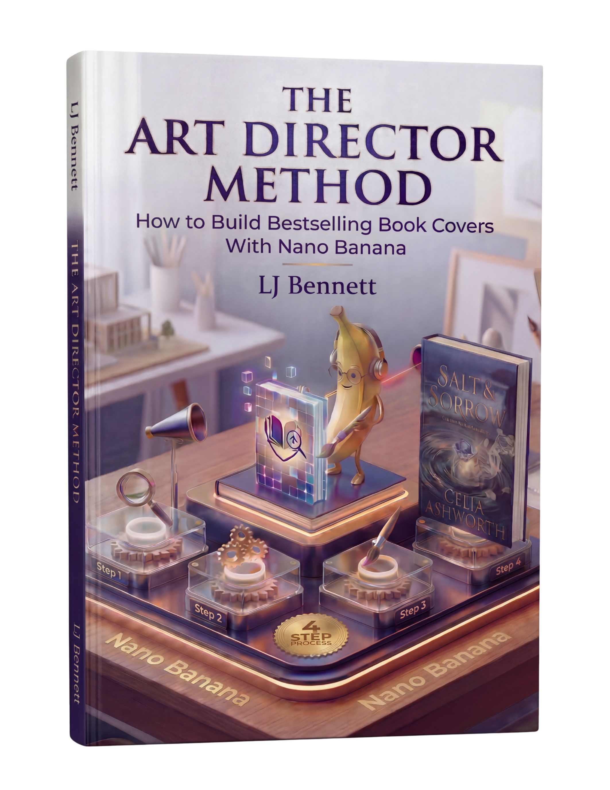
The Art Director Method ($19.99) covers AI-generated cover creation for all formats, including the unique requirements of Vella's square-to-circle display. When you know how to direct AI with specific composition and framing instructions, creating Vella covers becomes fast and reliable.
This is exactly what The Art Director Method using Nano Banana teaches you to do right.
Turn Nano Banana from a slot machine into your creative partner.
Get the Guide - $19.99Frequently Asked Questions
Kindle Vella covers must be uploaded as 1600 x 1600 pixel squares in JPEG or TIFF format. However, Amazon displays them as circles, cropping the corners. All important visual elements should be kept within the central circular area, roughly 1200 pixels in diameter from the center.
No. Vella displays your story title separately in the interface, so text on the cover is redundant. At the small display sizes Vella uses, text becomes unreadable and adds visual clutter. The circular crop can also distort text near the edges. The best Vella covers are purely visual with no text at all.
Amazon crops Vella covers from a square into a circle for display. This means the four corners of your uploaded square image are cut off. Roughly 21% of the image area is removed. To fix this, design with the circular crop in mind: keep all important elements centered and leave the corners as non-essential background.
Yes, and AI works especially well for Vella covers because the format needs a single compelling image with no typography. Generate at a 1:1 square ratio, direct the AI to center the subject, and specify a clean background with high contrast. Tools like Google Gemini's Nano Banana can produce Vella-ready images with the right creative direction.