The Gap Between Good-Looking and Best-Selling
There are thousands of beautiful book covers that don't sell books. There are also plenty of simple, even plain-looking covers on books that sell millions. The difference isn't quality. It's strategy.
A bestselling cover does three things simultaneously: it signals genre instantly, it's readable at thumbnail size, and it creates an emotional response that matches the reading experience. If your cover only does one or two of these, it's leaving money on the table.
Tip #1: Pass the Thumbnail Test
Your cover will appear at roughly 144 pixels tall in Amazon search results. That's tiny. At that size, most detail disappears. What survives? High-contrast elements, bold typography, and strong composition.
Here's how to test: shrink your cover to thumbnail size and ask three questions. Can you read the title? Can you identify the genre? Does the main visual element register? If the answer to any of these is no, redesign.
Common thumbnail killers: ornate script fonts, busy backgrounds, low contrast between text and image, and too many visual elements competing for attention. Simplify until it works small.
Tip #2: Speak Your Genre's Visual Language
Every genre has visual codes that readers recognize instantly. Dark color palettes, stark typography, and isolated figures signal thriller. Warm tones, flowing script fonts, and couples or close-up faces signal romance. Bright colors, whimsical illustration, and playful fonts signal cozy mystery.
These codes exist because they work. Readers browsing Amazon make snap judgments based on covers. A romance reader scrolling past your book needs to know it's a romance in under two seconds. If your thriller uses pastel colors and script fonts, readers will skip it - not because it's ugly, but because it's sending the wrong signals.
Research is non-negotiable. Look at the top 20 bestsellers in your specific sub-genre. Note the patterns. Then make sure your cover fits within those patterns while still standing out. You want to be recognizable as part of the genre, not identical to everything else in it.
Tip #3: Master Typography Hierarchy
Typography is where most indie covers fail. Even authors who nail the imagery stumble on fonts. Here's the hierarchy that works:
- ●Title: biggest and boldest. This is the primary text element. It should be readable at thumbnail size. Use a font that matches your genre - serif for literary and historical, bold sans-serif for thrillers, script or decorative for romance.
- ●Subtitle or tagline: smaller but visible. Not every cover needs one. If you include it, keep it short and position it near the title.
- ●Author name: consistent with your brand. For debut authors, keep it modest. For established names, the author name can be as large as the title - your name IS the selling point.
Maximum two fonts on a cover. One for the title, one for everything else. More than two fonts looks amateur. No exceptions.
Tip #4: Use Color Psychology Intentionally
Colors trigger emotional responses before conscious thought kicks in. Dark blues and blacks create tension and mystery. Warm golds and reds create passion and urgency. Greens suggest nature and growth. Purples signal luxury or fantasy.
Your color palette should match both your genre codes and the emotional experience of your book. A psychological thriller with a bright yellow cover is sending mixed signals. A feel-good beach read with a dark, moody palette will confuse readers. Match color to emotion, match emotion to genre, and your cover starts selling before a single word is read.
Tip #5: Create Contrast and Focal Points
The human eye is drawn to contrast. Light against dark, warm against cool, sharp against soft. Your cover needs a clear focal point - one element that draws the eye first. Then the eye moves to the title, then to the author name. That's the visual path you're designing.
Covers without a clear focal point feel chaotic. Covers with too many competing elements confuse the eye. The best covers are surprisingly simple: one strong image, one strong title, one clear emotional signal.
Tip #6: Study What's Selling, Not What You Like
Your personal taste is irrelevant. What matters is what your target readers respond to. The covers you admire as art may not be the covers that perform as sales tools. Go to the Amazon bestseller lists in your genre every month. Note what's charting. Look for patterns, not individual covers. The patterns tell you what the market responds to.
Putting It All Together
These tips are principles. Implementing them consistently across every cover you publish is a system. The Art Director Method is that system, built specifically for indie authors using AI tools. It teaches you how to decode genre visual codes, apply them to AI-generated imagery using Nano Banana, handle typography like a professional, and test your covers before publication. At $19.99 for the complete 88-page guide, it's the most efficient way to turn these principles into a repeatable process.
This is exactly what The Art Director Method using Nano Banana teaches you to do right.
Turn Nano Banana from a slot machine into your creative partner.
Get the Guide - $19.99Frequently Asked Questions
Bestselling covers nail three things: genre accuracy (readers identify the genre in under 2 seconds), thumbnail readability (title and genre clear at 144 pixels), and emotional alignment (the cover's mood matches the reading experience). Design for sales first, aesthetics second.
Critical. Most readers discover books through Amazon search results where covers appear at roughly 144 pixels tall. If your title isn't readable and your genre isn't recognizable at that size, readers scroll past. The thumbnail test should be the first checkpoint in your cover design process.
Match fonts to your genre: serif fonts for literary fiction, historical, and nonfiction; bold sans-serif for thrillers, sci-fi, and action; script or decorative fonts for romance and cozy mysteries. Use a maximum of two fonts per cover. The Art Director Method includes font recommendations by genre.
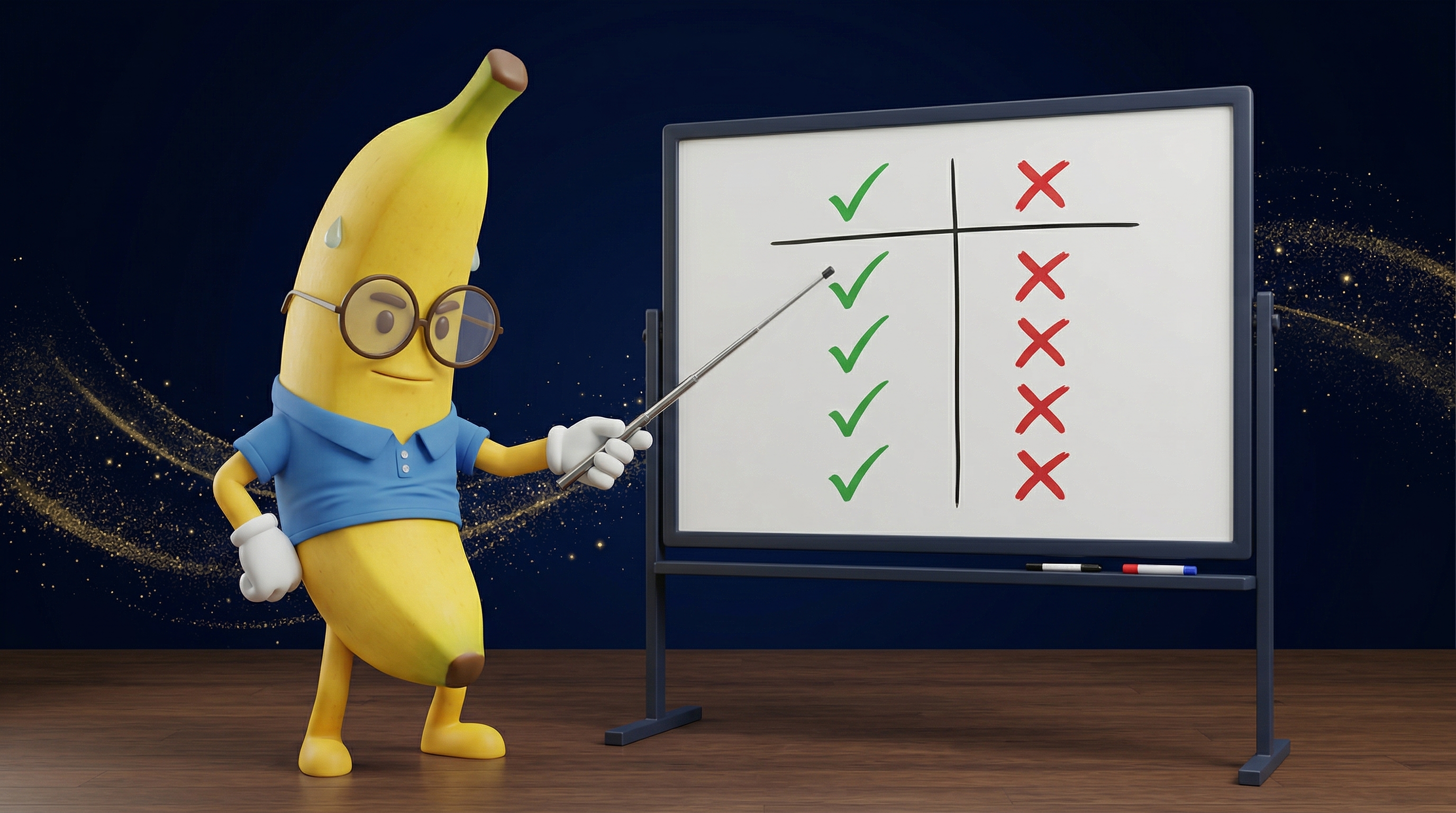
Run three tests: the thumbnail test (is it readable at 144px?), the genre test (would a reader browsing your genre recognize this as the right genre?), and the comparison test (place it next to the top 10 bestsellers in your sub-genre - does it fit in while still standing out?). If it passes all three, it's ready.