Why Color Is the Most Important Design Decision on Your Cover
Before a reader registers your title, your author name, or even the imagery on your cover, they process color. It takes less than a tenth of a second. In that fraction of time, their brain has already categorized your book into a genre, assigned it a mood, and made an initial judgment about whether it's for them. Color isn't decoration. It's the first and fastest communication your cover makes.
This is why bestselling covers in the same genre tend to cluster around similar palettes. It's not a coincidence, and it's not a lack of creativity. It's reader psychology at work. Readers scan visually, and color is how they find what they're looking for. A romance reader scrolling Amazon isn't reading every title. She's scanning for reds, pinks, warm tones. A thriller reader is scanning for dark blues, blacks, high contrast. If your color palette doesn't match the genre, readers scroll right past you, no matter how good the story is.
The Genre Color Map
• Red: Romance, thriller, suspense, dark romance, passion. Red triggers urgency and intensity. It signals heat, danger, desire. Contemporary romance often uses softer reds and pinks, while thrillers lean into deep crimsons and blood reds. If your book involves strong emotion or high stakes, red belongs on your palette.
• Blue: Mystery, self-help, business, science fiction, literary fiction. Blue communicates trust, depth, and intelligence. Light blues feel calm and approachable (self-help, memoir). Dark navy or midnight blue creates intrigue (mystery, thriller). Electric blue signals sci-fi and technology.
• Black: Horror, dark literary fiction, psychological thriller, true crime. Black is absence, mystery, dread. It creates visual weight and signals seriousness. Paired with red, it says danger. Paired with white, it says stark literary power. Horror covers lean heavily on black because it does the emotional work before the imagery even registers.
• Yellow and Orange: Children's books, humor, feel-good fiction, self-help, cookbooks. These are optimistic, approachable colors. They say "this is fun" or "this will make your life better." Bright yellow grabs attention on crowded shelves. Orange is energetic without being aggressive.
• Green: Nature, environment, wellness, fantasy, middle-grade fiction. Green signals growth, the natural world, and freshness. Dark emerald works for epic fantasy. Bright green works for eco-nonfiction and health. Soft sage works for contemporary wellness titles.
• Purple: Fantasy, spiritual, paranormal romance, mystical. Purple is rare in nature and communicates royalty, magic, and otherworldliness. It shows up consistently across fantasy subgenres and spiritual nonfiction.
• Gold and Metallics: Premium nonfiction, historical fiction, award winners, literary fiction. Gold signals value, prestige, and quality. It's the color of "this is important."
The 60/30/10 Rule for Book Covers
Professional designers use the 60/30/10 color rule, and it works beautifully for book covers. Here's how it breaks down:
• 60% - Dominant Color: This sets the overall mood and genre signal. It's usually the background or the largest visual area. For a dark thriller, this is black or deep blue. For a romance, it might be a warm blush or deep red.
• 30% - Secondary Color: This adds depth and contrast. It might be the main subject, the typography, or a secondary design element. It should complement the dominant color without competing.
• 10% - Accent Color: This is your attention-grabber. A pop of gold on a dark cover. A bright red title on a moody blue background. The accent directs the eye to what matters most, usually your title or a key visual focal point.
When covers feel "off" or amateurish, unbalanced color is often the culprit. Too many colors competing for attention. No clear hierarchy. The 60/30/10 rule fixes that instantly.
Directing AI with Color Precision
Here's where color psychology becomes a practical superpower. When you understand which colors work for your genre and how to balance them, you can give AI incredibly specific direction. Instead of a vague prompt like "make a romance cover," you can say "dominant palette of deep crimson (60%), cream and blush tones (30%), with gold foil accents on the typography (10%)." That level of direction produces professional results because the AI isn't guessing. It's executing your creative vision.
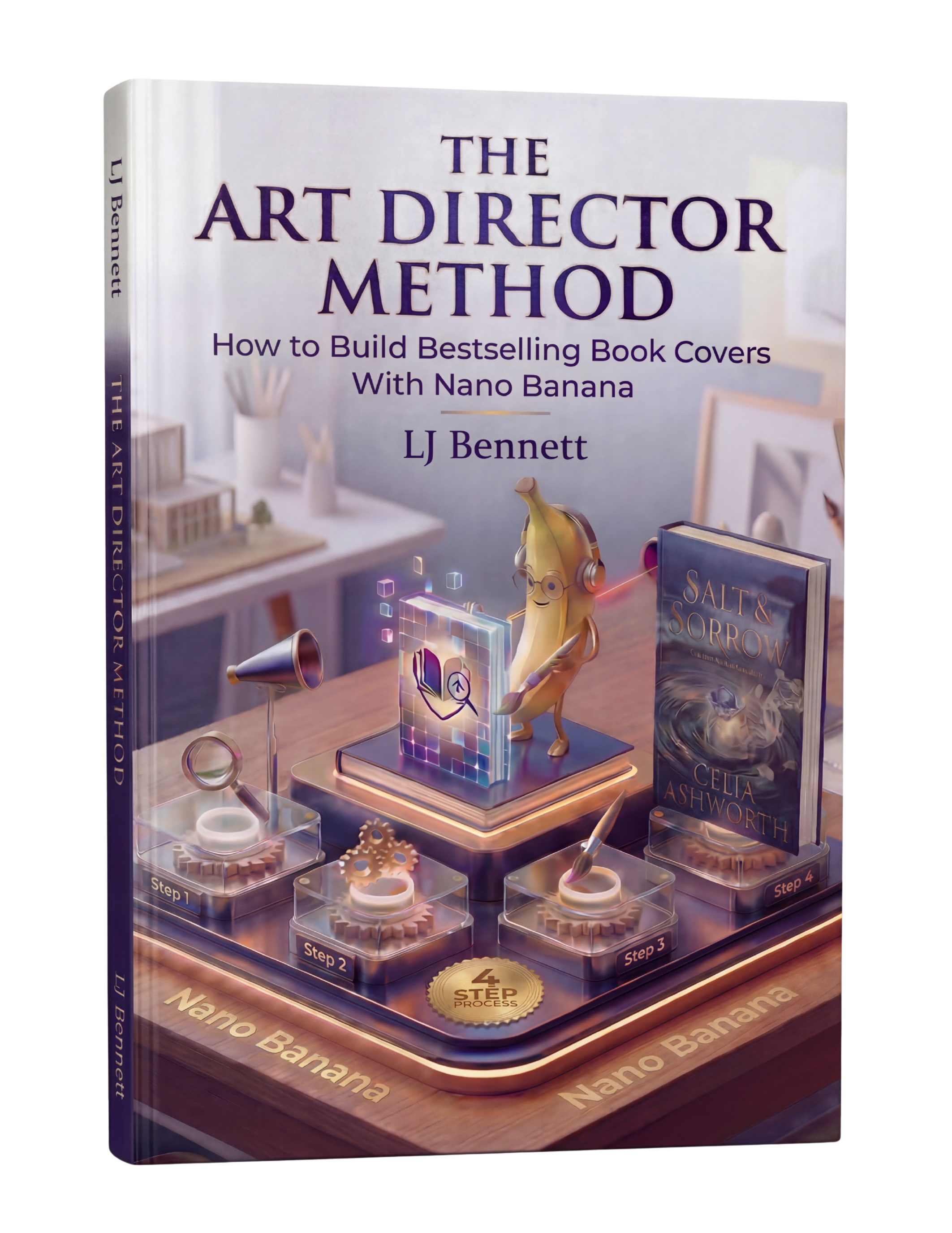
Google Gemini's Nano Banana models respond well to color-specific prompts. You can reference exact moods ("desaturated teal like a Nordic noir film"), temperature ("warm amber and copper tones"), or even specific comparisons ("the same deep burgundy palette as Colleen Hoover's recent covers"). The Art Director Method ($19.99) teaches you how to build these precise color directions into your prompts so every cover hits the right genre signals from the first generation.
Research Before You Design
Before choosing your palette, spend 15 minutes on Amazon. Pull up the top 20 bestsellers in your specific subgenre. Screenshot their covers. Look at the dominant colors. You'll see patterns immediately. Those patterns exist because they work. Readers have been trained by thousands of covers to associate certain colors with certain genres. You don't need to copy, but you need to speak the same visual language. Stand out within the genre conventions, not outside them.
This is exactly what The Art Director Method using Nano Banana teaches you to do right.
Turn Nano Banana from a slot machine into your creative partner.
Get the Guide - $19.99Frequently Asked Questions
Red, pink, and warm tones are the strongest colors for romance covers. Deep crimson works for dark and steamy romance, soft pinks and blush tones suit sweet and contemporary romance, and black paired with red signals dark romance. The key is matching the shade to your subgenre while following the 60/30/10 color balance rule.
The 60/30/10 rule means using 60% dominant color (sets mood and genre), 30% secondary color (adds depth), and 10% accent color (draws the eye to your title or focal point). This ratio creates balanced, professional-looking covers. It's the same principle interior designers and brand designers use.
Genre covers cluster around similar colors because readers use color to identify genres at a glance. Romance readers scan for reds and pinks, thriller readers scan for dark blues and blacks. These associations are built over years of browsing. Covers that break genre color conventions get overlooked because readers don't recognize them as being in their preferred genre.
Yes. AI image generators like Google Gemini's Nano Banana respond well to specific color direction. Instead of vague prompts, you can specify exact palettes like 'dominant deep navy, secondary silver-grey, gold accent on typography.' The Art Director Method teaches how to build precise color instructions into AI prompts so you get genre-appropriate covers on the first try.