The Cover Is Not for You
The most important thing to understand about book cover design mistakes is that they almost always come from the same place: designing for yourself instead of your reader. Your cover is not a piece of personal art. It's a sales tool. It has one job: get the right reader to click. Every mistake on this list stems from forgetting that.
Mistake 1: Overcrowding
Too many elements competing for attention. Multiple images, decorative borders, taglines, series titles, review quotes, and three different fonts all crammed onto one cover. The result is visual noise. Nothing stands out because everything is trying to. The fix: simplify ruthlessly. One strong focal point. One mood. Your title. Your name. That's usually all you need.
Mistake 2: Wrong Genre Signals
A romance novel with a dark, brooding cover that looks like a thriller. A literary fiction title with a cartoonish font. A children's book with sophisticated, muted tones. Genre confusion means the readers who would love your book never click on it, and the readers who do click feel misled. Study the top 20 bestsellers in your subgenre before designing anything. Match the visual language readers already expect.
Mistake 3: Low-Resolution Images
Pixelated, blurry, or stretched images scream amateur. This was a bigger problem before AI, when authors used cheap stock photos and scaled them beyond their limits. With AI generation, you can create high-resolution imagery from scratch, but you still need to generate at the right size and maintain quality through any editing or resizing steps.
Mistake 4: Amateur Typography
This is the single biggest giveaway of a self-published cover. Bad font choices (Comic Sans, Papyrus, overused free fonts), poor kerning, text that's hard to read against the background, and inconsistent font pairing. Typography is where most DIY covers fall apart, even when the imagery is strong. The fix: use proven genre-appropriate fonts, limit yourself to two fonts maximum, and make sure text is readable at every size.
Mistake 5: Ignoring the Thumbnail
Your cover might look gorgeous at full size. But most readers first see it as a tiny thumbnail on Amazon, Apple Books, or Kobo. If your title is unreadable at thumbnail size, if the imagery becomes a blur, if the color contrast is too subtle, your cover fails where it matters most. Always design for the thumbnail first and scale up. Not the other way around.
Mistake 6: Wrong Dimensions
Amazon's ideal ebook cover ratio is 1.6:1 (1600 x 2560 pixels recommended). Upload the wrong dimensions and your cover gets cropped, stretched, or surrounded by white borders. Each platform has specific requirements. Check them before you design, not after.
Mistake 7: Weak Composition
No clear focal point. The reader's eye doesn't know where to land. Good composition guides the eye from the main visual element to the title in a natural flow. Bad composition scatters attention. The rule of thirds, leading lines, and clear visual hierarchy aren't just art school concepts. They're the difference between a cover that works and one that doesn't.
Mistake 8: Image Rights Issues
Using stock photos without the right license. Using images you found on Google. Using photos with recognizable people without model releases. These mistakes can result in takedown notices, legal action, or unexpected licensing fees after your book is already published. Know your rights before you use any image.
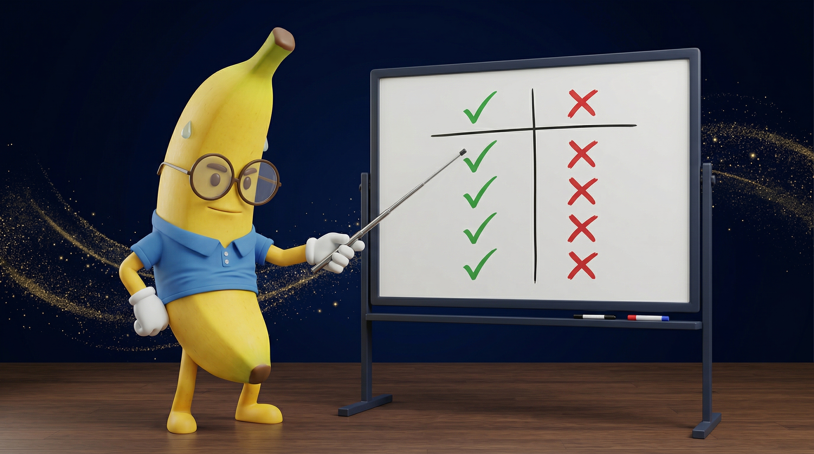
The AI-Specific Mistakes
• The "Obviously AI" Look: Unedited AI generations have telltale signs. Overly smooth skin, impossible lighting, inconsistent details, that waxy perfection. Readers are learning to spot these. Post-production editing is not optional.
• Prompt-and-Pray: Typing a vague prompt into an AI tool and hoping something good comes out. This produces generic, directionless imagery. Professional AI cover creation requires creative direction: genre research, mood boards, color palettes, composition planning. The same skills you'd use to brief a human designer.
• Skipping Post-Production: Taking a raw AI generation and slapping text on it. No color correction, no cropping, no refinement, no typography work. AI gives you an excellent starting image. It doesn't give you a finished cover. The editing and typography work after generation is what separates amateur from professional.
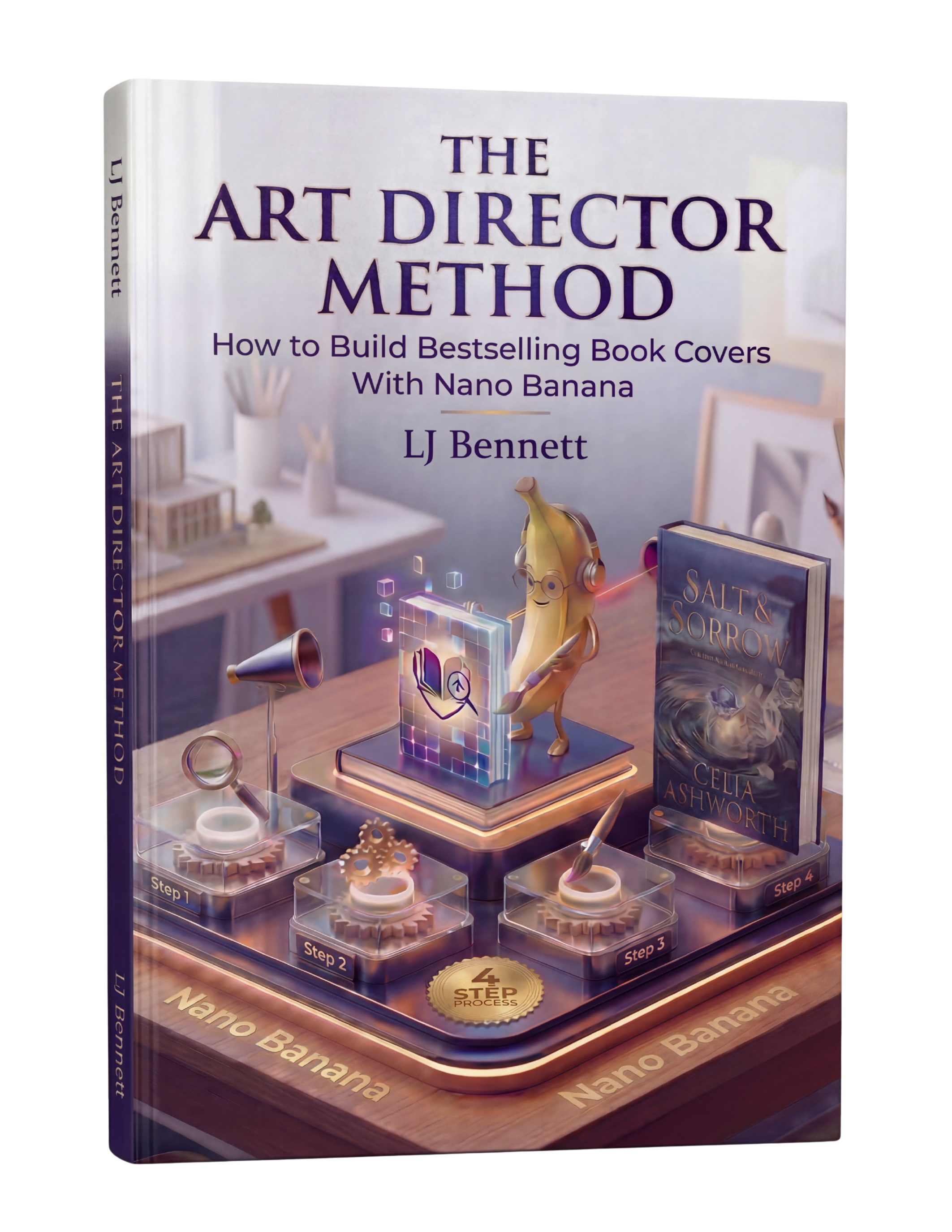
The Art Director Method ($19.99) exists specifically to solve the AI-specific problems. It teaches the creative direction skills that turn vague prompts into precise instructions, and covers the full workflow from concept through finished cover, including the post-production steps most authors skip.
This is exactly what The Art Director Method using Nano Banana teaches you to do right.
Turn Nano Banana from a slot machine into your creative partner.
Get the Guide - $19.99Frequently Asked Questions
The most common mistake is wrong genre signals. A cover that doesn't match genre expectations means the right readers scroll past it. Study the top 20 bestsellers in your subgenre before designing. Match their visual language (color palette, imagery style, typography) while adding your own unique twist within those conventions.
The biggest giveaways are poor typography (bad font choices, hard-to-read text), overcrowded design with too many elements, low-resolution or blurry images, and failing the thumbnail test. Shrink your cover to the size of a postage stamp. If the title is unreadable or the image becomes a blur, it needs work.
Raw, unedited AI generations can have a telltale 'AI look' with overly smooth textures and impossible details. However, AI-generated covers that include proper creative direction, post-production editing, and professional typography are indistinguishable from traditionally designed covers. The key is treating AI as a starting point, not a finished product.
Professional covers have four things in common: correct genre signals, strong typography with no more than two complementary fonts, a clear focal point with good composition, and readability at thumbnail size. These principles apply whether you hire a designer, use AI, or design it yourself.