You're Not Alone
Every author who's tried AI for book covers has been here. You type in what you want, the AI generates something, and it looks... off. Not terrible, maybe. But unmistakably "AI." Something about it screams amateur. You've seen other people share stunning AI-generated covers online, so you know it's possible. But your results look like a different tool entirely.
The good news: this is fixable. The bad news: the fix isn't switching tools or buying a more expensive subscription. The fix is changing HOW you communicate with the AI. Here are the seven most common reasons AI book covers look bad, and exactly how to fix each one.
Reason #1: You're Prompting Literally, Not Conceptually
The problem: You describe what should physically appear in the image. "A woman in a red dress standing in front of a mansion at sunset." The AI dutifully renders exactly that, and it looks like a stock photo with an AI filter on it.
The fix: Describe the concept, mood, and atmosphere instead of listing objects. What does the scene FEEL like? What's the quality of the light? What emotional response should a viewer have? Think about how a film director describes a scene to a cinematographer. They don't say "put a woman here." They talk about the tone, the tension, the way light falls through the window. Give your AI the same kind of direction.
This single shift transforms AI output more than any other technique. It's the difference between "a picture of something" and "a cover that makes you feel something."
Reason #2: You're Ignoring Genre Visual Codes
The problem: Your cover looks like a nice image that has nothing to do with your genre. It could be for any book. Readers don't recognize it as belonging to their preferred genre, so they scroll past.
The fix: Research the top 20 bestsellers in your specific sub-genre. Note the color palettes, composition styles, typography, and imagery patterns. These are your genre codes. Build them into your AI prompts explicitly. If thrillers in your sub-genre use dark blue palettes with high contrast, tell the AI that. If romance covers use warm golden light, specify it.
Reason #3: Your Composition Is Wrong for a Book Cover
The problem: The AI generates a beautiful landscape or portrait, but there's no room for your title. Or the focal point is dead center with no visual breathing room. Or the image is so busy that any text you add becomes unreadable.
The fix: Specify composition in your prompt. Tell the AI you need negative space in the upper third for a title, or that the focal point should sit in the lower two-thirds. Mention the aspect ratio (2:3 for a standard book cover). Think about where your text will go BEFORE you generate the image, not after.
Reason #4: The Lighting Looks Flat or Fake
The problem: Your AI images look evenly lit, like everything is illuminated from all directions at once. There are no shadows, no depth, no atmosphere. This is the "AI look" that experienced readers spot immediately.
The fix: Specify lighting direction, quality, and color temperature. "Warm sidelight from the left casting long shadows" gives you drama. "Cool blue moonlight from above" gives you atmosphere. "Soft golden hour backlight" gives you warmth. Lighting is the single most impactful detail you can add to a prompt for photorealistic results.
Reason #5: Too Many Elements Competing
The problem: You packed your prompt with every element from your book. A character, a building, a weapon, a magical artifact, a pet, a landscape, and a moon. The AI tries to include everything and the result is visual chaos.
The fix: One focal element, one mood, one concept. The best book covers are surprisingly simple. A single strong image that conveys the essence of your book will always beat a cluttered scene that tries to tell the whole story. Your cover's job is to create interest, not summarize the plot.
Reason #6: You're Using the Wrong Art Style
The problem: You asked for a "book cover" without specifying an art style, and the AI defaulted to something that doesn't match your genre. Or you specified "photorealistic" for a genre that uses illustrated covers (or vice versa).
The fix: Match your art style to your genre codes. Thriller and romance typically use photorealistic or cinematic styles. Fantasy and middle grade often use illustration. Literary fiction might use artistic photography or minimalist graphic design. Specify the style explicitly in your prompt.
Reason #7: Your Typography Kills the Image
The problem: You generated a decent image but slapped on the wrong font, used too many fonts, picked colors that clash with the image, or sized the text so it's unreadable at thumbnail size.
The fix: Typography deserves as much attention as imagery. Use maximum two fonts. Match font style to genre. Make your title readable at 144 pixels tall (thumbnail size). Use colors that contrast with the image behind them. If you have a dark image, use light text. Add a subtle drop shadow or dark overlay if needed for readability.
The Real Fix: A Complete System
Each of these fixes helps on its own. Together, they transform your results completely. But implementing all seven consistently, for every cover, is where most authors struggle. You fix the lighting but forget the composition. You nail the genre codes but botch the typography.
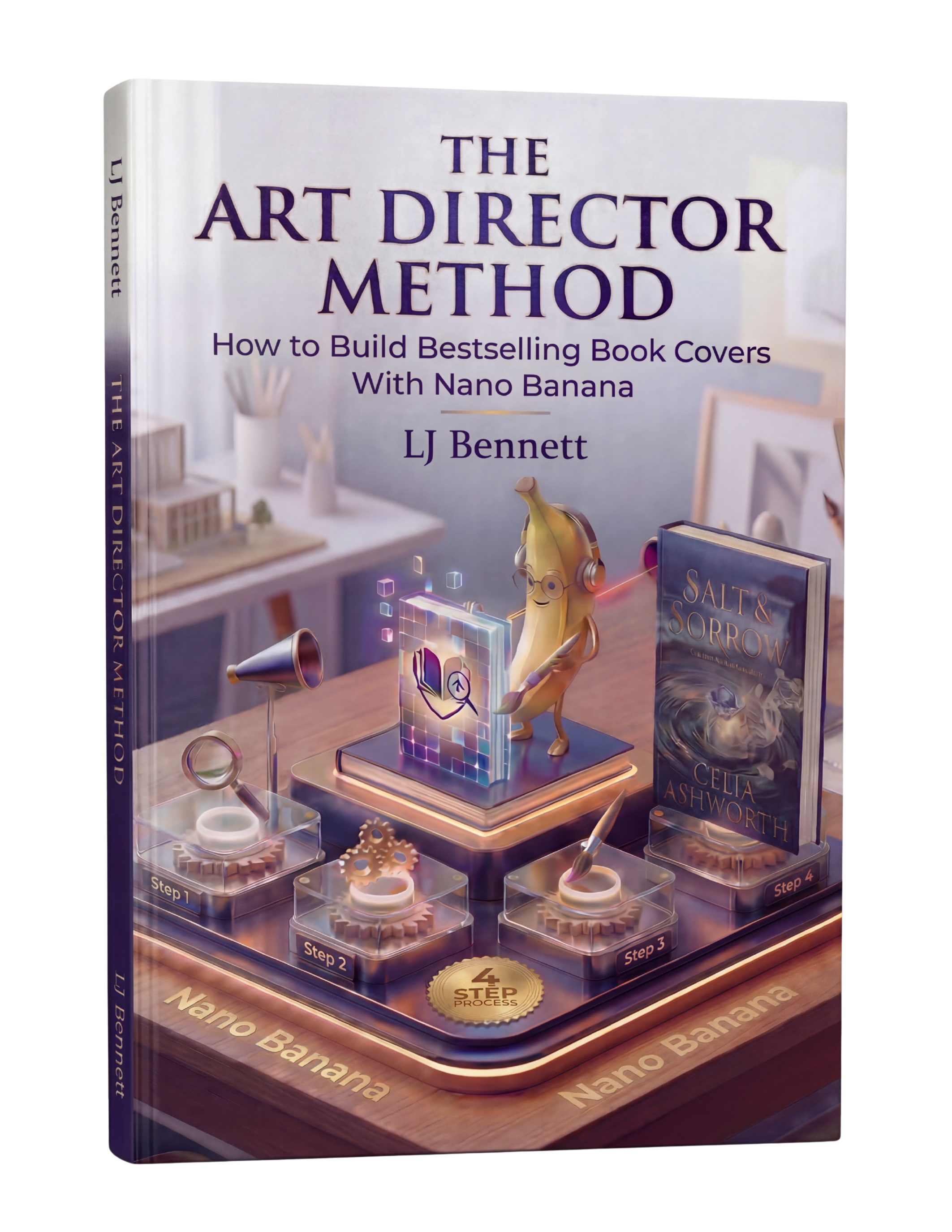
That's why The Art Director Method exists. It's an 88-page system that puts all seven of these fixes (and more) into a repeatable workflow you can follow every time. Built specifically for indie authors using Nano Banana, it takes you from "why does my AI output look bad?" to "people can't believe I made this myself." $19.99, and you'll never struggle with AI cover quality again.
This is exactly what The Art Director Method using Nano Banana teaches you to do right.
Turn Nano Banana from a slot machine into your creative partner.
Get the Guide - $19.99Frequently Asked Questions
AI covers look fake primarily because of flat lighting, generic composition, and literal prompting. When you describe objects instead of mood and atmosphere, the AI produces flat, stock-photo-like results. Specifying lighting direction, color temperature, and emotional atmosphere in your prompt dramatically improves realism.
Three key changes: prompt conceptually (describe mood and atmosphere, not just objects), match your genre's visual codes (research bestselling covers in your sub-genre), and invest time in typography (the right font at the right size in the right color makes or breaks a cover). The Art Director Method teaches all three in a systematic workflow.
Google Gemini's Nano Banana produces the most realistic results when given detailed conceptual prompts. It's also free. But the tool matters less than the method - any AI tool produces generic results with generic prompts. The Art Director Method teaches creative direction techniques that work with Nano Banana to produce professional, genre-accurate covers.
Readers can spot AI covers that were made with generic prompts - flat lighting, perfect symmetry, and lack of intentional composition are the giveaways. Covers made with proper creative direction (specific lighting, mood-driven prompting, genre-accurate codes, professional typography) are indistinguishable from traditionally designed covers.
Probably not. If your covers look bad in Midjourney, they'll look bad in DALL-E too. The issue is almost always the prompt and method, not the tool. Before switching tools, try the fixes in this article - especially conceptual prompting and genre codes. If you want a complete system, The Art Director Method teaches the full creative direction process using Nano Banana.