The Amazon Thumbnail Problem
Here's what most authors don't realize: the first time a reader sees your book cover on Amazon, it's roughly the size of a postage stamp. On a search results page, your cover competes with 15-20 other books displayed at around 120 x 180 pixels. On a phone, it's even smaller. Every design decision you make needs to serve that tiny thumbnail first.
This is the fundamental challenge of Amazon book cover design, and it's why so many beautiful covers fail commercially. A cover with gorgeous detail, subtle texture work, and elegant typography can look stunning at full size and become an unreadable blur at thumbnail size. The covers that sell are the ones that communicate genre, mood, and professionalism in that split-second thumbnail glance.
Design for the Thumbnail, Scale Up
The professional approach is to design at thumbnail size first. Before you finalize any cover concept, shrink it to 120 x 180 pixels and ask yourself three questions:
• Can I read the title? If not, the font is too small, too thin, or doesn't have enough contrast against the background.
• Can I tell the genre? If the color palette and imagery don't instantly signal your genre at thumbnail size, readers won't click.
• Is there one clear focal point? If the composition is too busy to resolve at this size, simplify.
Only after your cover passes the thumbnail test should you focus on the full-size details. The thumbnail is where the sale starts. The full-size image is where the reader confirms their interest.
Bold Colors on Amazon's White Background
Amazon displays covers on a white page background. This means covers with white, very light, or washed-out edges disappear into the page. They lose their boundaries and look unfinished. Covers with strong, dark, or saturated edges pop off the page because they have clear visual boundaries.
High-contrast color combinations work best: dark background with bright title text, deep rich backgrounds with metallic or white typography, saturated colors that don't fade into the white surroundings. If your genre typically uses lighter palettes (some romance, children's books, self-help), add a subtle border or ensure the cover edges have enough definition to stand alone.
The Genre Match Paradox
"Standing out" on Amazon doesn't mean what most authors think. It doesn't mean being radically different from every other cover in your genre. Readers use genre visual cues to find what they want. A thriller reader scrolling through dark, high-contrast covers is going to skip the pastel watercolor cover, no matter how artistically interesting it is.
Standing out means being the most polished, most compelling, most professionally executed version of what readers expect in your genre. The cover that pops isn't the one that breaks all the rules. It's the one that executes the rules better than the competition.
Study the top 20 bestsellers in your subgenre. Note their color palettes, imagery styles, typography choices, and composition patterns. Those patterns are your template. Then aim to execute at that level or above.
Amazon's Technical Requirements
Amazon recommends a 1.6:1 height-to-width ratio, with ideal dimensions of 2560 x 1600 pixels for ebook covers. Minimum is 625 x 1000 pixels, but submitting at minimum resolution means your cover looks blurry on high-resolution devices like Kindle Fire and tablets. Always submit at the maximum recommended size.
Accepted file formats are TIFF and JPEG, with JPEG being the most common. File size can be up to 50MB. There's no DPI requirement for ebooks (DPI only matters for print), but the pixel dimensions matter. Get them right.
The A/B Testing Advantage
The authors who consistently have the best-performing covers on Amazon are the ones who test. They create multiple variations, run them through PickFu polls or Facebook reader groups, and let reader data pick the winner. When you're creating covers with AI, generating 10 test variations costs nothing extra. You can test color palettes, imagery styles, typography treatments, and compositions against real readers before committing to a final design.
Simple Wins on Amazon
The covers that perform best on Amazon share a common trait: simplicity. One strong image. One clear mood. A readable title. A clean author name. That's it. No cluttered backgrounds, no competing elements, no text-heavy subtitles fighting for attention.
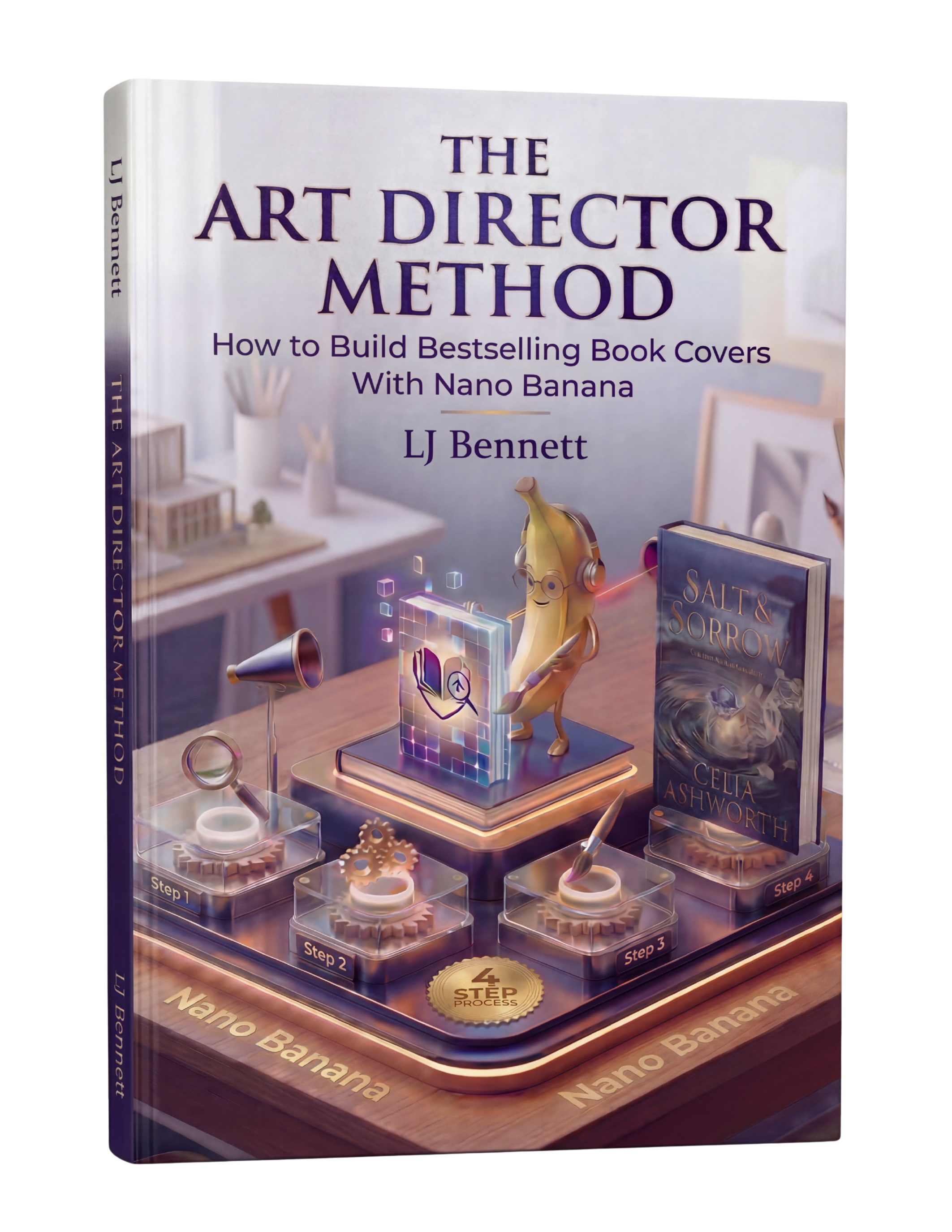
When you use AI to create cover imagery with Google Gemini's Nano Banana, you can direct it toward bold, simple compositions from the start. The Art Director Method ($19.99) teaches this thumbnail-first approach, helping you create covers specifically optimized for the Amazon browsing experience. You direct the AI toward what works at thumbnail size, not just what looks impressive on a desktop monitor.
This is exactly what The Art Director Method using Nano Banana teaches you to do right.
Turn Nano Banana from a slot machine into your creative partner.
Get the Guide - $19.99Frequently Asked Questions
Amazon recommends 2560 x 1600 pixels (1.6:1 height-to-width ratio) for ebook covers. The minimum is 625 x 1000 pixels, but always submit at the maximum size for best quality across all devices. File format should be JPEG or TIFF, up to 50MB.
Design for the thumbnail first since readers see your cover at roughly 120 x 180 pixels in search results. Use bold, high-contrast colors that stand out on Amazon's white background. Keep the composition simple with one clear focal point. Make sure the title is readable at thumbnail size. Match your genre's visual conventions so readers recognize your book instantly.
Most covers that look bad on Amazon were designed at full size without considering the thumbnail. Covers with fine details, thin fonts, subtle color palettes, or complex compositions lose their impact when shrunk to thumbnail size. Covers with light or white edges also disappear into Amazon's white page background. Always test your cover at thumbnail size before publishing.
Yes. Readers use visual genre cues to find books they want. A thriller that looks like a romance will be skipped by thriller readers and disappoint romance readers who click. Study the top 20 bestsellers in your subgenre and match their visual language (colors, imagery style, typography). Stand out by executing genre conventions better than the competition, not by breaking them.